
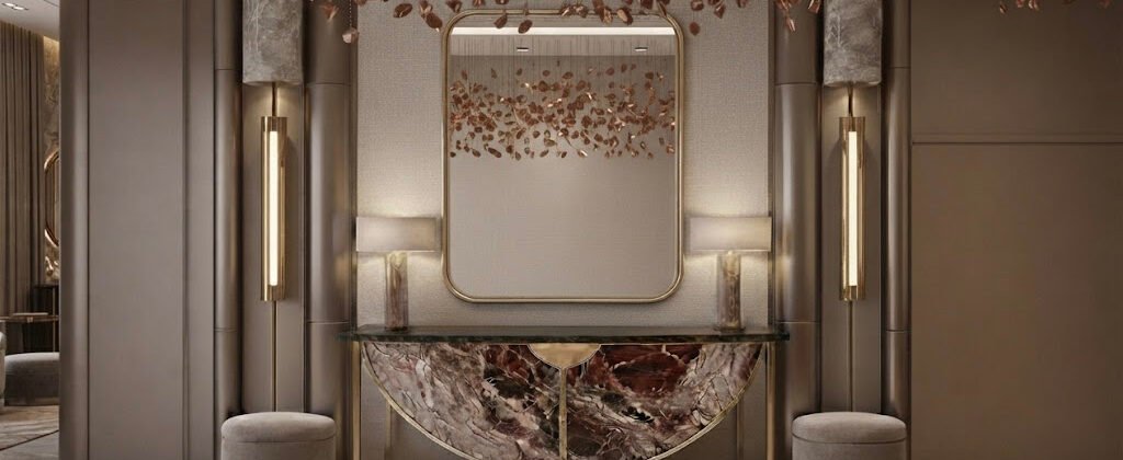
The Psychology of Color in Home Design
There is a moment in almost every project where the conversation stops being about layout, finishes, and square footage, and becomes about something less tangible. The client will stand in an empty room, look at the swatches spread across the floor, and ask some version of the same question they have been circling since the first consultation. Why does this colour feel the way it feels? Why does one palette make the room feel calm and another make it feel anxious, even when the furniture is the same? Why does the house across the street, with the identical floor plan and a similar budget, feel like a completely different place to live?
The honest answer is that colour is not a finishing decision. It is the foundation decision. The mood of a home is set long before the first sofa is delivered, often before the first tile is selected, and almost always in the half-second between walking into a room and deciding whether to stay. Every other design choice is a refinement of the feeling that colour established first.
Understanding how colour actually works on the human nervous system is one of the most underrated skills in interior design. Most people choose colours based on what they have seen in magazines, on social media, or in someone else’s home they admired. Those sources are useful, but they are borrowed instincts. The colour decisions that produce a home you genuinely love living in, rather than one that simply photographs well, are the decisions rooted in colour psychology. Not the pop-psychology version with the rigid “blue is calming, red is aggressive” claims that dominate the internet. The more nuanced, evidence-based version that considers undertones, saturation, the direction of natural light, the cultural associations a colour carries in this region, and the specific way each pigment behaves against the marble, the timber, and the textiles that surround it.
How Colour Actually Affects the Human Brain
The physiological response to colour is real and measurable. A 2014 study published in Environment and Behavior, the long-running academic journal that explores how built environments shape human experience, found that room colour directly affects perceived temperature, perceived spaciousness, and subjective emotional state within the first 90 seconds of entering a space. White and cool blue interiors were consistently perceived as cooler in temperature, even when the actual ambient temperature was held constant. Warm reds and deep ochres were perceived as emotionally stimulating, with measurable increases in heart rate compared to neutral palettes.
The more recent research, particularly the 2020 Journal of Environmental Psychology paper on residential colour preferences, has refined this understanding. It is not the colour alone that determines the emotional response. It is the relationship between the colour and the light it sits in. The same beige that looks warm and grounding in a north-facing room with soft natural light can look flat and lifeless in a south-facing room flooded with harsh midday sun. The same deep navy that feels sophisticated and enveloping in a low-ceilinged apartment can feel oppressive and heavy in a cavernous villa with double-height windows. Designers who treat colour as a fixed decision rather than a relationship with the architecture are the ones whose projects look beautiful in the rendering and underwhelming in person.
This is also where regional context matters more than most homeowners realise. In the Gulf, where the quality and intensity of natural light is fundamentally different from London or New York, the colours that work in international design publications often behave very differently when they cross into a Dubai living room. A cool greige that reads as elegant in a Scandinavian interior can look grey, sterile, and even slightly clinical under the bright desert light of a UAE afternoon. The undertones that disappear in overcast European weather become exaggerated and unavoidable in Gulf sunlight, and a colour that was intended to feel neutral can quietly feel cold for the entire life of the home.
The Warmth Spectrum: Beige, Terracotta, and the Colours That Belong in the Gulf
There is a reason the most successful Dubai interiors of the past five years have leaned into warm, earthy, sun-faded palettes. They are not following a trend. They are responding honestly to the climate.
Warm beiges, soft taupes, terracotta, dusty ochre, and the entire family of sun-baked neutrals that draw from the natural landscape of the Arabian Peninsula are psychologically grounding in a way that cool greys and stark whites struggle to match in this environment. The 2019 Color Research and Application study on residential colour trends in hot climates found that occupants of homes finished in warm neutral palettes reported higher subjective comfort, stronger sense of place, and better emotional satisfaction with their interiors than occupants of homes finished in cool, high-contrast palettes — even when the two homes were of identical construction and identical square footage.
What is happening physiologically is straightforward. Warm colours sit at the same wavelength as natural desert light, and they harmonise with the visual environment outside the window. A home that echoes the landscape feels continuous with it. A home that fights the landscape, that insists on cool greys and stark whites in a city of sand and sun, creates a quiet but persistent visual friction that registers subconsciously as discomfort.
The same logic explains the growing popularity of muted greens in Gulf interiors. Sage, eucalyptus, and the dusty olive tones that have dominated recent design publications work here not because they are fashionable but because they are the colours of oasis vegetation, of shaded gardens, of the rare and precious greenness that defines the most beautiful landscapes of the region. A living room finished in soft sage against warm timber feels like a place to exhale. A living room finished in stark white against cold marble feels like a showroom, even when it is someone’s home.
The Colours That Change a Room’s Geometry
One of the most underestimated psychological effects of colour is its ability to alter the perceived dimensions of a space. Most homeowners understand intuitively that dark colours make a room feel smaller and light colours make it feel larger, but the actual application of this principle is more nuanced and more useful than the simple version.
The 2017 study published in the Journal of Interior Design measured how room geometry is perceived under different colour treatments. The findings were clear but more sophisticated than the conventional wisdom. Light colours on walls do not just make a room feel bigger. They make the walls feel further away from each other. Dark colours do not just make a room feel smaller. They make the walls feel closer, more enclosing, more intimate. Used deliberately, this effect is one of the most powerful tools in interior design, and it is one of the most consistently wasted.
A double-height living room with a soaring ceiling often feels impressive but cold, particularly in a large Dubai villa where the volume of the space overwhelms the intimacy the family actually wants from the room. A deep, warm colour on the upper portion of the walls, transitioning to a lighter tone below, draws the eye downward and creates an immediate sense of warmth and enclosure. A powder room that feels cavernous because the ceiling is too high for the square footage can be made to feel intimate and enveloping with a single saturated colour on every surface, including the ceiling. A long, narrow corridor can be made to feel like a deliberate architectural gesture rather than a leftover passageway by painting the end wall in a deep, confident accent colour that anchors the view.
These are not aesthetic decisions. They are psychological interventions, and they work because the human brain reads colour as spatial information before it reads it as decoration.
Cultural Colour Associations in the Middle East
Colour symbolism in the Gulf and the wider Middle East is layered in ways that international design references often miss. The colours that carry specific meaning here are not the same colours that carry the same meaning in Western design culture, and a palette that feels celebratory in one cultural context can feel inappropriate in another.
White, which in Scandinavian design culture signals purity, simplicity, and modern restraint, carries very different associations in the Gulf. It is the colour of mourning at certain religious occasions, the colour of purity and intention in others, and the colour of generosity when it appears in the crisp white kandura or the white marble of a majlis. The same wall colour can be received entirely differently depending on which occasion the room is being prepared for, and the most experienced designers in the region plan their palettes with this in mind.
Green, particularly the deep, saturated green associated with Islamic tradition and with the Prophet Muhammad, carries spiritual significance that extends well beyond aesthetic preference. A living room finished in emerald or sage reads as respectful and considered in a way that the same colour in a different cultural context might simply read as fashionable. Blue, the colour of protection and good fortune in much of the Middle East, is one of the few regional preferences that aligns almost perfectly with international design trends toward deep, oceanic blues. The cultural weight of the colour here, however, gives it a depth of meaning that purely trend-driven applications lack.
The colours associated with celebration, with the gold of henna, the fuchsia of celebration attire, the deep red of ceremonial occasions, are the colours that register as joyful and significant in a Gulf home. Used as accents, in textiles, in artwork, in a single feature wall, they create the kind of emotional resonance that purely neutral palettes cannot.
The Mistake Most Homeowners Make With Colour
The single most common colour mistake in Dubai interior design is choosing colours from inspiration images without considering the light. The pinterest-perfect grey that looked serene in a photo of a London townhouse reads as cold and slightly institutional in a Dubai apartment with floor-to-ceiling windows facing east. The warm taupe that looked sophisticated in a magazine spread of a New York loft can look flat and muddy against the bright, saturated natural light of a UAE morning.
The second most common mistake is choosing all the colours at once. Most homeowners arrive at the design phase with a fully formed palette, often assembled from a dozen different sources over months of browsing, and present it to the designer as a finished brief. The result is a room that contains every colour the client has ever loved, which is almost always a room that contains no coherent feeling at all. A successful interior colour palette is built around one dominant mood, two supporting tones, and a single accent. Anything beyond that is decoration, not design.
The third mistake is changing the colour after move-in because the original choice did not feel right once the furniture was in place. This is not a failure of the original decision. It is a failure of the sample process. Paint samples pinned to a wall for an afternoon are not enough. A proper colour test, with large sample boards observed at different times of day under the actual light conditions of the room, is the only reliable way to make a final colour decision. The designers who insist on this discipline are the ones whose clients are still happy with the colour choice three years later.
Building a Palette That Holds Over Time
The most successful interior colour schemes are not the ones that look best in the first month. They are the ones that still feel right in the fifth year, when the home has been lived in, the novelty has faded, and the colour is no longer the most exciting thing about the room. Trend-driven palettes fail this test. Personal, well-considered palettes pass it.
A home that draws its colour logic from the landscape, from the light, from the cultural context of the region, and from the actual emotional life of the family who lives there will age in a way that a trend-driven palette cannot. The warm beige that echoed the desert sun on the day the family moved in will still feel like home on the day their second child starts school, because the colour was never borrowed from a magazine. It was chosen in response to the place, and places do not go out of style.
The most rewarding colour decisions are the ones that are difficult to explain to other people, that do not appear in any design publication, that were made because a particular shade of soft terracotta caught the late afternoon light in a way that felt like the room had been waiting for it all along. Those are the decisions that turn a house into a home, and they are the decisions that no algorithm and no trend forecast can make for you.
Working on a home where the colour palette needs to feel considered rather than borrowed? Talk to the Worood Interiors team about a design consultation that starts with how you want to feel in the space, not how you want it to photograph.
